3 October 2013
Follow @ortaInterested in finding the CocoaPods Logo? Check out our Media Pack.
CocoaPods is arguably one of the most important open source project in the Objective-C community. It's used in thousands of applications and has hundreds of thousands of downloads.
Building the tool, the community and the ecosystem around the project has happened organically with a mix of people coming and helping out to get us to a position where CocoaPods is essential to any project.
Starting from May 2013, I've been working with Andy Myers to try and re-think the systems around CocoaPods, ranging from how we do documentation to the branding. This blog post is to open up our process a bit and to explain how we came to some of these ideas.
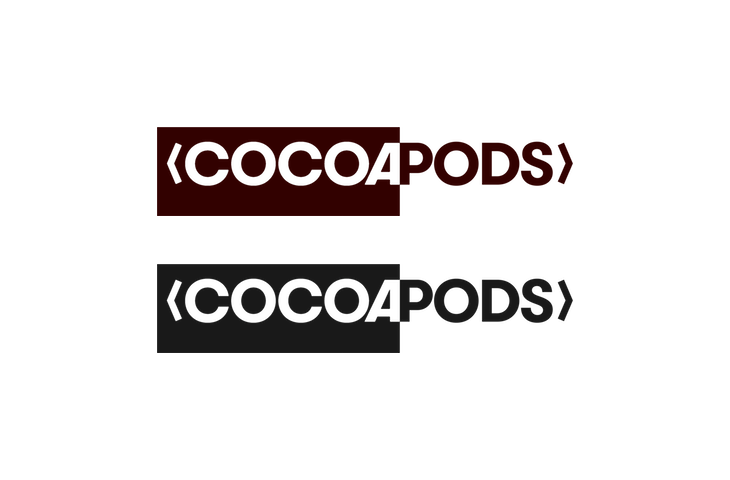
The first and most obvious change is the logo. Here it is in mono-colour.
We took ideas from the Objective-C import directives, OS metaphors for text selection and colours from the Cocoa Pods themselves to create a new modern logo.
CocoaPods itself is a collection of projects like the multiple gems that create the terminal tool, the search engine, CocoaDocs and more. We needed to find a way that we can provide a similar identity between all the different sub-projects that are public facing. In my opinion the jQuery foundation did a great job at this. By having the logo neatly split along the selected and unselected edge we can easily extend the logo depending on our needs.
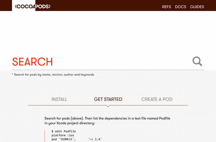
Once we had the logo down the visual identity was starting to appear, we spent some time looking at the analytics for cocoapods.org and tried to get a feel for how the website is used. Turns out most of the outgoing links are based on search queries. So we priorised the initial screen to give precedence for searching and then to go straight into learning for people who have just heard of the project.
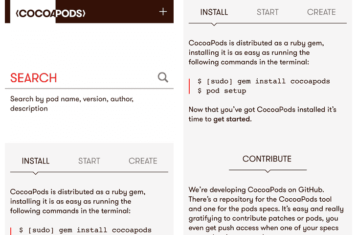
Whilst looking at the analytics we were surprised to find that the percentage of mobile browsers wasn't what we hoped it to be. So the designs were done in parallel for mobile and for desktop.
The work on the CocoaPods design is on-going and has just started; there's a lot of focus now on the blog so that we can be sure of the foundations before moving on to the new user documentation. But that is a blog post for another time.


